LV design system
Design system as a knowledge base for product development

Client
LegalVision
Team
CTO
Engineers
🔍 Background
Both Habitat and Prism were launched to cater to the needs of LegalVision and its customers within a very tight deadline. The focus was on shipping and learning quickly, so that we could continue iterating on an ongoing basis. As a small product team, we also had many other tech projects on the side, team members had to work across multiple fronts.
📌 Problem
Our products were not initially designed and built with the goal of scalability and reusability.
📣 Objective
On the foundation of LegalVision's brand identity, the LV design system should drive greater consistency and efficiency across all our products on different platforms.
🙌 My role
🚀 Business Impact
Documentation
Scale up elements based on atomic design principle
Foundation
Grid, Typography, Colour, Iconography...
Components
Accordion, Alert, Avatar, Badge...
Patterns
List, Navigation, Page Header, Table...

Key Components - Button
Visibility, adaptability
For the most important touchpoint in a data-heavy interface, I made the button border round to maximise visibility.
8 different types ensured enough subtlety to fit each scenario, whether it needed to be toned up or toned down.


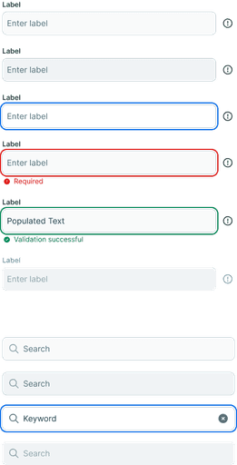
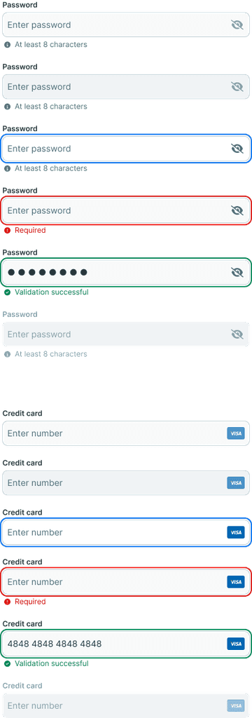
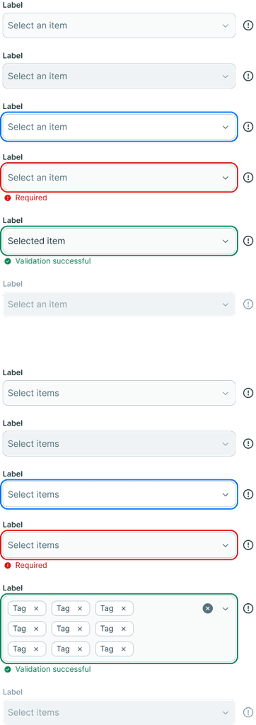
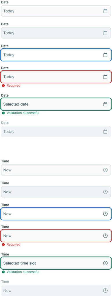
Key Components - Input
Accessible, unambiguous
Form elements should be self-explanatory, so I utilised diverse visual cues such as labels, icons, imagery to convey the functionality as clearly as possible.
Most of our users were not very tech-savvy, there was no question the input field had to be the most recognised, vertically aligned, classic style.
Platforms transition
Accessible, unambiguous
The implementation of design system in products didn't work in a linear way. There was a lot of back and forth, it was a fine balance to achieve between covering scenarios and avoiding rigidity. I wanted to ensure designers would always have a solid foundation to start a new project, but not have their creativity hindered by layers of restriction, after all, we are just a small team.
One of the biggest challenges was how to make it work for different products. My solution to this was to create a nesting framework. On one hand, we had a universal system where it provided all elements that could be used in any product, on the other hand, there was a local satellite system that contributed components for specific product.


💪 retrospectives
Focus on both big picture and small details
Building a design system is an interesting exercise. If you proceed without a clear plan, it is likely to be hard to reach a desirable outcome. There were times when we needed context to understand the problem to solve, and there were also times when we needed to avoid distractions and simply concentrate on the craft and pixels.
The smaller the element, the bigger the consideration
During the process, I spent a disproportionate amount of time experimenting with setting up the foundation because small elements like type scale and colour range defined the character of the product. Meanwhile, the choices should be kept to a minimum, most of the pages wouldn't need 6 sizes of headings, or 10 gradients of blue. Designer or developer would be able to know the right variant to use when approached the document.